In the previous post, we created some 360 tours for the Heritage Trust for the North West (HTNW), to help present their sites to global visitors, or people who may be isolating through Covid.
The next project enabled us to refine the offering and address some issues arising from the previous work.
Key points:
- The HTNW website is being upgraded to a new style and colour scheme.
- The 360 Tours will be refined, to engage casual visitors.
- Heritage Tags – permanent signage – will be put up outside physical sites, linking their visitors to virtual sites with QR codes.
Heritage Tags : Here’s a Heritage tag. Stuck up outside a heritage site, anyone is free to scan it and be taken to a small ‘vignette’ site (mobile data friendly) which will tell them something about it, and lead them to more information:

For the heritage tags themselves, we chose aluminium-faced lightweight foam signs, which are very hard-wearing. The printer was Discount Displays, and the sign material was Dibond.
Styling: Much respect must go to Dave Bixter, who designed the heritage tags, and the new HTNW branding. They are really eye catching. His treatment document for branding and colour scheme was really easy to refer to. Finally – he designed the icons for the info points as a freebie. Classy.
360 Tours
The vignette page, linked to by the QR code gives the casual visitor immediate information – a bit of history, facilities and opening times. From here, the visitor can go the main page describing the heritage site. It’s here that they meet the same content as would be displayed to visitors arriving from a search engine. It’s this which has received the major upgrades, including the revamped 360 tour.
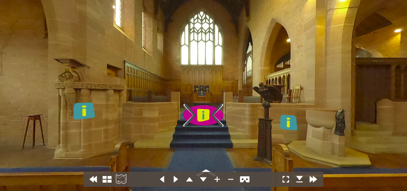
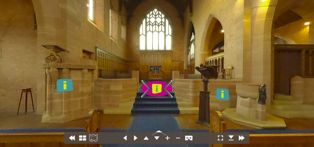
The idea here was to get to something which could be displayed as a tab on the heritage site’s page, which appealed to a casual visitor, and drew them in. So, changes were needed to the orginal tours to give a bit more bizazz. Outgoing are the video tours, and much of the touring element, reducing the overall size. We removed or simplified the floorplans and tour controls, making the 360 content more prominent. We also removed the welcome screens, so the 360 content was immediate as the visitor clicked on the tab. Incoming are styled information icons (thanks, Dave) and a new ‘click me first’ information point:
Information Points turned out to be a hugely underestimated problem – again! – and one whose scope we should have paid a great deal more attention to.
Our proposal re-scoped Information points as being small, single-sentence pop-ups within the 360 tour. We ran into two big problems:
- Compared with the information points they were replacing, they were seriously lacking.
- What if changes are needed, later on?
To detail that last point – the text for the information points is baked into the tour. Editing the text means editing the tour, and republishing. It’s a job for a specialist. We can’t justify spending money on the extra software and know-how needed, if we only want to make changes to the information point text; it’s overkill.
First things first: The single sentence content sucks. Enter Ruth, specialist Interpretation Advisor. Her advice:
Find out who you’re presenting to. Work out what you want to tell them, how you want to say it and in what order: Demographic, learning objective, narrative. From that, you’ll understand what is needed.
Sounds a bit much for a bit of infotainment, right? But we’re representing a heritage organisation, with disemination as much a part of their mission as preservation – so what do we want our audience to come away with? Let’s see:
The demographics. Who are we talking to? It turns out that gets a bit complicated:
After imersion in the Audience Agency’s Museums spectrum reports, it’s clear we are dealing with no less than 3 broad groups:
- people who visit exclusively online
- people who travel to visit a site (and scan the heritage tag)
- people who are local to the site (and scan the heritage tag)
Such a broad catchment indicated a very wide demographic, with often conflicting interests. We turned to looking at what might be common in the audience’s expectations of the site: as the 360 tour is part of the ‘hook’ – the part of the site’s page looking to cement engagement – visitors may well be happy with an entertainment bias. It might not provide the depth that a specialist audience might require, nor would it approach the local demographic with something that spoke exclusively to them, but it would provide both potential visitors and locals with something enticing, so they could look further at a later point. In short: keep it light.
With this in mind, our information point style would be (broadly):
- Readability age – about 12 years
- Tone – active, exciting, vibrant and colourful present tense if possible, people doing things as well as things happening in the past.
Next, those Learning Objectives: Each site was assigned a interpretation plan, in which each information point had an objective, content plan and an order.
Which leads us to narrative: How do we tell a story to a casual visitor, moving through a virtual space – each site having its own unique shape and its own complicated history?
Planning, we gave each tour an introduction icon, which entices the visitor to tap on it. After that, we placed information points of equal importance in the same photosphere area and ensured that narrative progressed as the visitor explored the site. We placed points in doorways, for example: Most rooms have a single function. Explaining that as the visitor enters, we added something more to the narrative. We also categorised and coloured information icons loosely as purple, green and yellow. Respectively: people, things and stories.
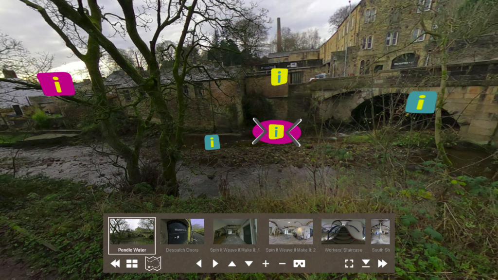
Finally, we arranged a sequence of thumbnailed locations as a guide. Visitors could then properly experience a narrative by tapping each one in turn. Here’s the Higherford Mill tour with a scrolling panel of thumbnails:
It was really hard in a place like Higherford Mill – the building has so much history and has seen so much change.
Hence the need for review:
That we needed to review everything in context, and that it was likely to require changes in future meant that we needed to find an easy way of editing the content, which didn’t rely on constantly rebuilding and deploying the 360 tour.
The solution was to make each information point its own web-page: external to the tour, and displayed in a pop-up window, within it.
The difficulty was in finding a solution which made editing convenient. We went through a number of options, factoring ease of use with cost, and came up with Google Docs as being the best solution. Not only does it enable collaborative editing, but it’s a cinch to use, and publishes documents as web pages. Great!
Well, no.
Google Docs’ publishing does a number of things to the formatting of a document which makes it very difficult to use within another website. Developers have tried to apply solutions to this but, ultimately, they all introduce an extra potential point of failure.
We had to drop it.
The very next best thing was another WordPress site, which turned out to be a ridiculously easy option.
Unlike the main site, the WordPress site for information points needs no special theming and its separation from the main site is great for security. It also manages responsiveness very well indeed and scales well to mobile screens. We found WordPress.com to be the perfect host, with a very reasonable £3 per month.
Scope Creep? With 60 information point documents, researched and written by RescueStation, CIC and edited (rewritten!) by Ruth, it certainly looks like it. But, if I’m being honest with myself, I would have to say I underestimated what was needed, causing myself a hell of a lot more work. Live and Learn, then. I have to admit, though, the diversion has been illuminating: I think learned a little too much about our industrial heritage to look at a mill building without inwardly wincing.
Takeaways?
- an interpretation specialist’s insight will turn a set of 360 photospheres into a genuine experience
- Don’t use Google Docs to do the job of a website!
Thanks to Ruth, for showing us the way.
This was the second post in the series, looking at how 360 photography can be a cost-effective way of creating engaging content for your heritage site or museum:
Digital for Museums and Heritage 1: 360 Tours
Digital for Museums and Heritage 2: Infotainment